There’s a lot to like about Desire2Learn version 10.1

Here we have it. Six months in to learning Desire2learn version 10.0 and version 10.1 is released. With some pretty significant changes I might add. But I’m ready. Bring it on.
Reading their press release and watching their Webcasts I quickly see there are lots of great new features that I can’t wait to test. However, I have a job to do outside of playing with new software so I narrowed my focus to the three feature changes that excited me the most. The new Content Interface for students and instructors, the due date feature in the Dropbox tool, and the improved Class/User Progress dashboards.
Improved Content Interface
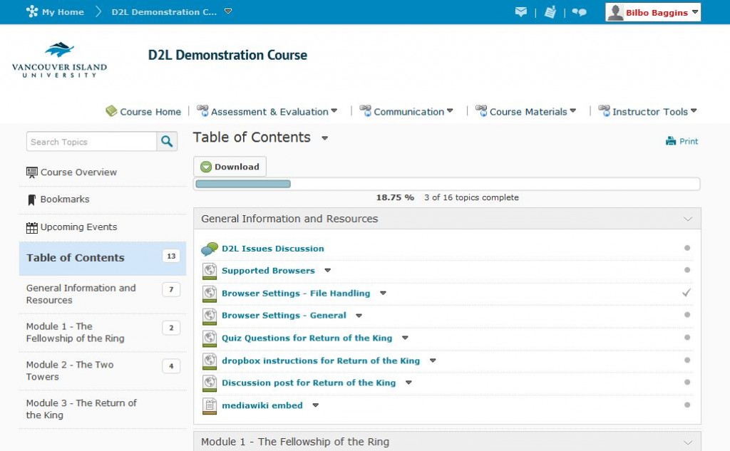
The first item on my list to check out is the new Content Interface. It’s completely changed. It no longer looks like a plain HTML page designed by a computer programmer. It has flair. It’s easy to use. Modules are listed on the left and content and tools are displayed on the right. It’s not rocket science, its web design. Also, the new Content Interface looks the same for both students and instructors. No more need for building in one view and testing in another to make sure your content displays properly for students. So far, so good.
While testing the new Content Interface as a student I found the magical part of this upgrade. Cross Browser Inline document viewing. Students can now view course files in their browser. It doesn’t matter if it’s an html page, a pdf, an office document, or a Google document or whether they’re using Firefox or Internet Explorer. I can already hear the sighs of relief from students, instructors, and technical support staff.
For an instructor the greatest part of the new Content Interface is the addition of Drag & Drop functionality. Not only can you drag and drop to reorder all content and modules (just like in Course Builder) but you can also drag files from your desktop right into the D2L Content Interface and drop them wherever you want them to go. Three cheers for technology.
However, I have to question why Desire2Learn would add drag and drop features to the Content Interface but not add it to the Manage Files tool. It seems like an obvious item to miss. When we asked D2L about this we were told that it’s a feature that will be considered for a future release.
In addition, although the new design has flair and is easier to use, it’s not perfect. Course files open in full frame and lose the side navigation bar which is the new feature that makes the Course Interface great in the first place. Instructors will miss some of the editing features they had before in Manage Content but they will love some of the additional editing features that have been added. We win some, we lose some.
Dropbox Due Dates
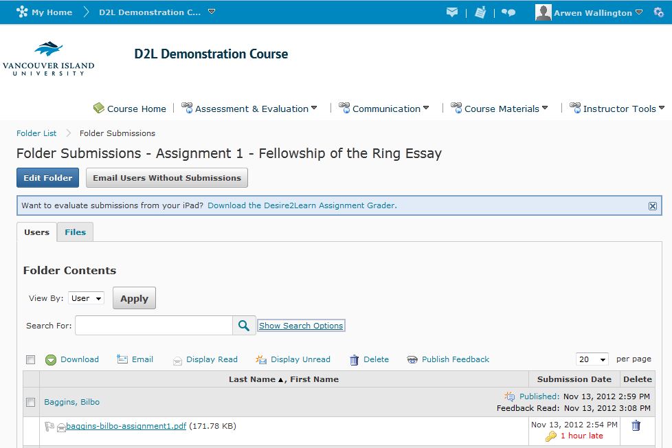
Desire2Learn heard the pleas of instructors everywhere and has added a Due Date option to the Dropbox tool. Instructors can now set availability dates AND due dates, allowing their students to submit late assignments if the instructor chooses. The date the assignment is submitted is recorded and late assignments are flagged with an additional time stamp in red indicating how late it was. If the instructor changes the due date, the recorded late time changes as well.
This isn’t a complex feature. Either you will use it or you won’t but either way, it works. It would have been nice to have the option of automatically deducting a percentage based on how late the assignment was submitted but maybe D2Ls working on that for the future as well.
Class/User Progress Dashboards
The final feature I just had to test is the Class/User Progress dashboards. Coming from Moodle to D2L I was very excited about the User Progress Dashboard in D2L version 10 but it definitely could benefit from some improvements.
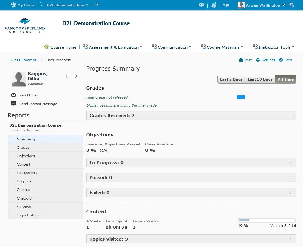
I have to say, D2L knocked the ball out of the park on this one. The User Progress Dashboard is easy to read and intuitive. An instructor can navigate through the dashboard and see the student’s progress in every activity for the entire course. You can even drill down and see which specific discussion the student posted in AND open up their post to read (just remember to right click and open the post in a new window or tab or you will be whisked away from your wonderful User Progress Dashboard).
The best part? The User Progress Dashboard is customizable. Instructors can select which tools they want to see in the dashboard and which ones they don’t. If you don’t use it in your course, why have it in your User Progress dashboard?
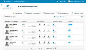
The Class Progress Dashboard didn’t excite me quite as much. It’s a useful tool to quickly compare all your students progression through the course but it’s very limited. You have the option of viewing class progress for all tools (Content, Checklists, Discussions, Dropboxes, Quizzes, Surveys, Objectives, Grades and Login History) BUT you can only pick 4 to view on the dashboard. That’s great if you only use four tools in an entire course but what if you use more? Then you’re adjusting your settings and shuffling around which tools you see on your dashboard. Not very well thought out in my opinion.
All in all I’m pretty happy with this upgrade. Desire2Learn has added some nice features that really increase the usefulness of the product for instructors and students. The majority of issues that existed in 10.0 still exist in 10.1 but Rome wasn’t built overnight and they’re nothing we can’t handle.
Happy D2Ling!
For more information on our migration from Moodle to Desire2Learn visit our Changing Learning Management Systems blog.


