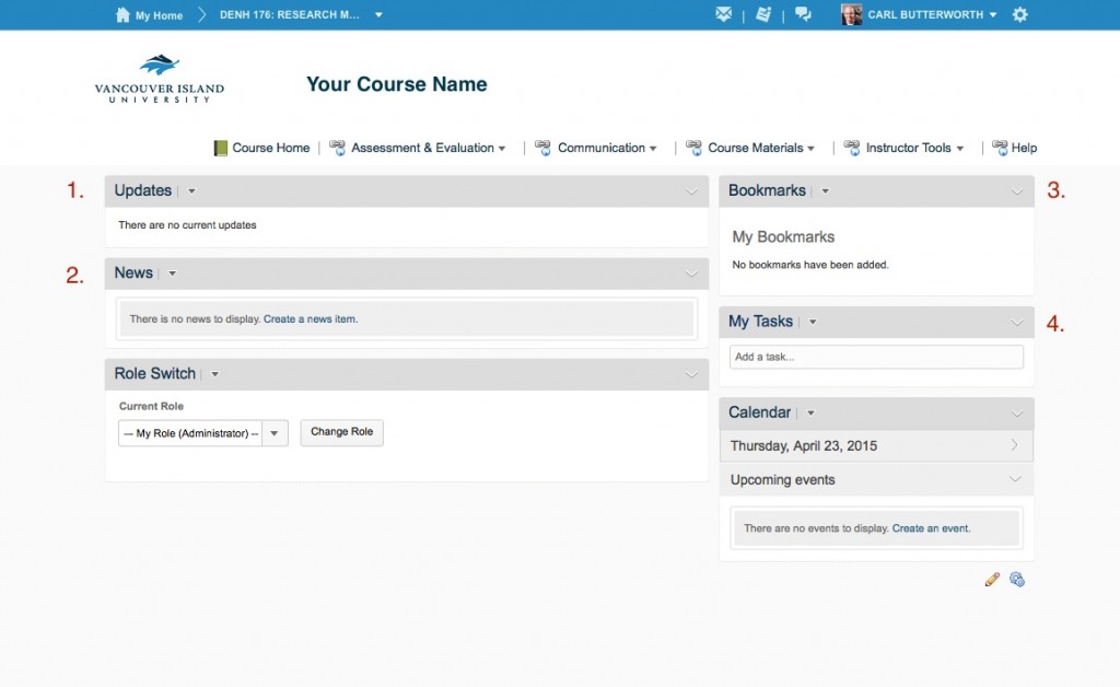
Over the last two years the CIEL has collected feedback on the homepage that we use for all of our courses in VIULearn. We have received a lot of great suggestions and have made some changes to the basic page template for this fall. We have tested this design with several departments on campus and have received great feedback on the new design.
- In response to a lot of feedback, we’ve removed the ‘Content Browser’ widget. This widget didn’t give access to all of the content in a course, and students missed content if they only used the browser widget. To get to content, students now click on ‘Course Materials’ and then ‘Content’. We will further simplify this workflow in the future.
- We’ve made the ‘News’ widget larger so that it can be a more dynamic space for you to use as a communication tool.
- We’ve added a ‘Bookmark’ widget for students that will allow them to mark and easily refer back to key content in the course.
- We’ve added a ‘Task’ widget for students so that they can keep track of course related to-dos in one place.
In Fall 2015, the Centre for Innovation and Excellence in Learning will undertake a larger examination of the user interface in VIULearn with input from both faculty and students.
Stay tuned for more details! If you have any questions or concerns regarding this change, please contact Carl Butterworth in the CIEL for further discussion.
