How many opportunities do we have to dramatically improve people’s lives just by doing our job a little better? – Steve Krug
I often consider this quote on accessible design when thinking about my course’s footprint in VIULearn. Over years of teaching blended asynchronous science courses, I have gathered some anecdotal evidence about how students approached VIULearn and how I can organize my courses to make it as easy as possible for students to find what they need. Every semester, I ask students informally what I can do or change to make using online learning tools easier for them.
What many of us understand after our “pivot” to remote delivery is that students who are hardworking, motivated, and would otherwise be successful can struggle with course technology and drop or fail a course. In addition to the expected course content and skills, students were also faced with the added cognitive load of learning to use learning technology, software, and (for some) computers for the first time. Many faculty members in my faculty of Academic and Career Preparation (ACP) wanted to know what they could do to reduce this overload and support their students success.
In December 2020, I helped conduct a survey of our students to explore ways to structure course materials in VIULearn. Most questions presented students with screenshots of anonymized sections of VIULearn courses and asked them to choose which they preferred. I focused on navigation and organization in VIULearn, as I saw these as the biggest contributors to cognitive overload and stress for students.
Below you will find some of the key recommendations and “quick wins” identified by the survey, along with some links to help you action these items in your own courses. If you would like to read the whole survey or see more detailed response data, you can look at the survey here.
Review Module Labels and Organization of Content
The clearest recommendation from students was consistency. Students wanted courses to be consistently organized to make it easier to find what they needed. They also wanted required and optional material to be organized or labeled consistently to help reduce their feelings of being overwhelmed.
When asked about organizing Content by week or by unit/topic, there was no clear majority answer. This is actually good news – it means we can do what makes sense for our courses as long as it is consistent.
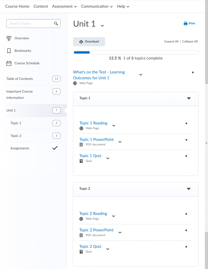
The same is true when creating submodules within the main modules. Students were asked to choose between a list of activities, and the same activities organized by type (for example: Readings, PowerPoints, Quizzes) or by topic (for example: Topic 1, Topic 2, Topic 3). Some form of organization was preferred over a simple list of items, as long as the structure was consistent in all modules. One example is shown below but is isn’t the only way to organize materials.

The great thing about this recommendation is that it doesn’t involve creating anything new! It is possible to create, rename, and re-arrange modules and submodules without deleting and re-creating them. It is also possible to click-and-drag content and activities into new places, again without having to delete and re-create them.
How To
Creating Structure in Your VIULearn Course: https://ciel.viu.ca/pages/create-structure
Modifying, Renaming + Deleting Content in VIULearn: https://ciel.viu.ca/pages/manage-course-content
Action-Oriented Labels for Content and Activities
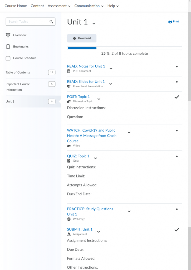
Have you ever been to a meeting or gotten an email and wondered what you are supposed to do with the information you were given? Students wonder the same thing! Over half of surveyed students preferred files and activities in VIULearn to have action oriented labels (Read, Watch, Post, Submit) and another quarter preferred labels to show the type of file or activity (PDF, PowerPoint, Discussion, Quiz).
These kinds of labels also help students to distinguish between required and optional material. Below is one example of action-oriented labels on content and activities, but of course other labels could be used as well.

Just like changing the titles of modules and submodules, the display names of uploaded files or activities you created in VIULearn can be edited without need to recreate any of the work you have already done!
How To
Modifying, Renaming + Deleting Content in VIULearn: https://ciel.viu.ca/pages/manage-course-content
Creating Discussion Forums + Topics: https://ciel.viu.ca/pages/set-discussions
Creating an Assignment Submission Folder: https://ciel.viu.ca/pages/create-assignment
Create and Edit Quizzes: https://ciel.viu.ca/pages/create-quiz
Tool Menus and Links to Instructions
A majority of surveyed students look for activities like quizzes, assignments, and discussions using the course navigation bar at the top of VIULearn. This means that no matter how well the Content area is organized, if the activities are out of order or not well labeled in the tool itself students may struggle to find what they need to do or submit to the correct location.
Another challenge is that if instructions for some activities are in Content, students may not see those instructions when accessing the activities directly from the tool. This challenge is compounded when the instructions page and the activity have different names, for example if instructions in Content are called “Assignment 3 instructions” but the assignment folder is called “Excel Data Assignment” in Assignments.
Once again, there are a few easy ways to address this challenge without completely rebuilding your course. Items like quizzes, assignments, and discussions can be reordered and renamed from their respective tools without any deleting needed. It is also possible to create links to your instructions in the descriptions of activities, so students are directed to the correct instructions without needing to search.
How To
Manage Discussion Forums + Topics: https://ciel.viu.ca/pages/manage-discussions
Creating an Assignment Submission Folder: https://ciel.viu.ca/pages/create-assignment
Create and Edit Quizzes: https://ciel.viu.ca/pages/create-quiz
Accessibility of Files
File formats and being able to download or print files was a concern for some students. When asked what file types they preferred when downloading or printing files, and almost half of surveyed students preferred PDFs. In comparison, only 6% preferred VIULearn files or web pages.
If you are considering changing or updating materials, your time is likely best spent saving your files as accessible PDFs. This should ensure your files are accessible to screen-readers and other text-to-speech programs, and you don’t have to learn how to recreate your content in VIULearn files or web pages.
The great news is that most major productivity software can export to accessible PDFs for free, so there is no cost and a low amount of additional work to save files as PDFs for students.
How To
Word file to PDF: https://support.microsoft.com/en-us/office/create-accessible-pdfs-064625e0-56ea-4e16-ad71-3aa33bb4b7ed
Pages file to PDF: https://support.apple.com/en-ca/guide/pages/tance1161f26/mac
Google Docs to PDF (under “Download a copy of a file”): https://support.google.com/docs/answer/49114?hl=en&co=GENIE.Platform=Desktop
Searchability for Important Information
When we are stressed even simple things can feel difficult, and this goes for our students as well. Key information students need to access class or contact us needs to be easily accessible to our students, especially because this kind of information is usually needed when students are already stressed or anxious.
The surveyed students suggested clear labeling (outlined in the Action-Oriented Labels for Content and Activities section above) or pinning the information to the Course Home page as ways to make this information easy to find when they need it.
How To
Modifying, Renaming + Deleting Content in VIULearn: https://ciel.viu.ca/pages/manage-course-content
Using the Announcements Tool in VIULearn: https://ciel.viu.ca/pages/announcements
References
ABE/FNFS Student Preferences Survey for VIULearn. https://wordpress.viu.ca/ciel/files/2021/08/commview357369216.pdf
Krug, S. (2014). Don’t make me think, revisited: A common sense approach to web and mobile usability. New Riders.
Pohan, C. A. (2020, April). In support of student learning: Managing cognitive load during emergency remote instruction. Center for Engaged Teaching and Learning at UC Merced. https://cetl.ucmerced.edu/Cognitive_Load
Triandafilide, J. (2020, October 9). Online teaching: Preventing the risk of cognitive overload. World of Better Learning, Cambridge University. https://www.cambridge.org/elt/blog/2020/10/09/online-teaching-preventing-the-risk-of-cognitive-overload/.