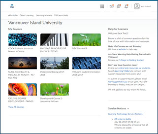
It’s been six months since Vancouver Island University (VIU) flipped the switch to Daylight (D2L’s new responsive design interface for their learning environment, Brightspace) on April 30, 2017 – and our story stays the same – all is well!
Seriously, making the switch has resulted in many benefits for both students and faculty members. Top of the list, the change has increased access for students to enable them to use a fully functional mobile learning environment. The previous mobile environment didn’t work well and definitely was not easy to use. The deployment of a responsive design interface (which allows for the same digital learning environment to be resized depending on device) is simply the biggest game changer for student learning!
 Here we are six months later. We are seeing a gradual increase in mobile device usage, hearing from students and faculty about the greater ease in accessing their courses on various devices and we are experiencing many positive reactions to the brighter, cleaner and more streamlined interface. In a nutshell, things went very smoothly with (honestly) no major blips, issues or concerns.
Although Daylight represents mostly a cosmetic/interface change, the addition of images to the My Courses page throws some faculty members either wanting help to change the default image (to custom image that is copyright and visually appropriate) or noting the additional time it now takes to download the My Courses page (with more images to load). While courses can still be accessed in list format, those on even good bandwidth connections do experience a 3-4 second (or more) load time for this page.
But hey, we know that no technology is perfect, let alone satisfies all the needs of the masses. But as we capture our reflections and thoughts in the slide deck above, we have to say that it was pretty painless and was definitely worth it for the benefits the new interface provides.
Some of the staff of the Centre for Innovation and Excellence in Learning at VIU recently presented at the D2L Connection: BC Edition event. The slide deck, links to blog posts and handout – all detail the six months of pre-preparation and change management activities, along with our highs and lows in reflection six months later. Please feel free to share.
- Blog Post # 1 – Link (Daylight is Coming! VIULearn Upgrades to a Modern Responsive Design April 30 – awareness of change to institution, links to slideshow and handout shown at Public Awareness Sessions)
- Blog Post # 2 – Link (Enhancements to VIULearn: My Home, Course Home and Nav Bar (April 30) – institutional-specific changes to My Home Navigation, My Home Layout and Course Home Layout)
- Blog Post # 3 – Link (‘Daylight’ Has Come and Gone: VIU’s Experience Moving to D2L’s New Responsive Design Interface – summarizing VIU’s move to Daylight for D2L Fusion Conference, sharing story with others)
- Blog Post # 4 – Link (VIULearn Looks Different! Updated to a Modern Responsive Design! – highlights of change for campus community for Fall 2017 return of staff/students)
Handout: VIU Daylight Has Come and Gone handout (PDF)| VIU Daylight Has Come and Gone handout (Word)
Slideshow: Direct URL
Let us know if you have any questions! learnsupport@viu.ca